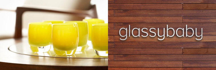
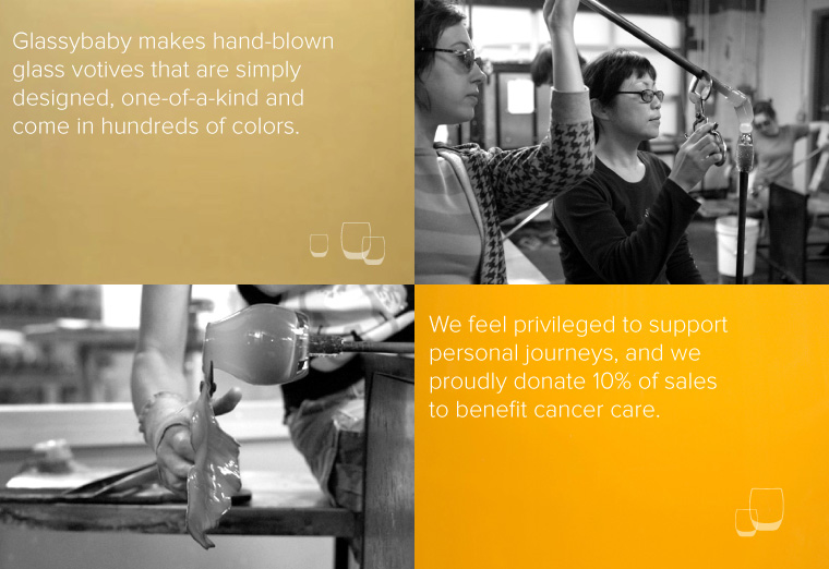
Glassybaby
Nurturing a growing brand
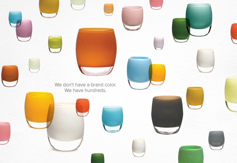
Let’s be honest, Glassybaby is an odd company. They make only one product (in hundreds of colors) and give away loads of cash to a cause. Not typical business-school-thinking. But Glassybaby has had phenomenal success, focusing more on what matters than what makes obvious sense.
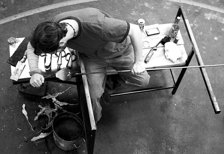
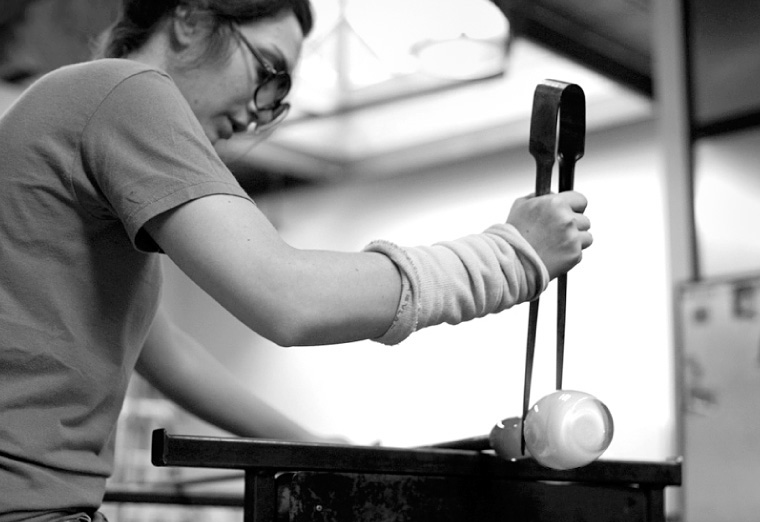
The company started with Lee Rhodes, a three-time cancer survivor. One day she put a tea candle in a small votive from a glass-blowing class. She gave a few to friends. Soon people were asking for them — like crazy. Lee instinctively saw a business opportunity that could also raise money for cancer treatment and research. She soon established a hot shop and retail store..
Following early success, the company focused on opening more stores in new cities. We were hired to prepare them for growth.
We set out to elevate the brand experience so that every detail matched the exceptional quality and spirit of the product itself — from visual identity to packaging to retail environments. True to Glassybaby, simplicity was key, with a wink of personality.
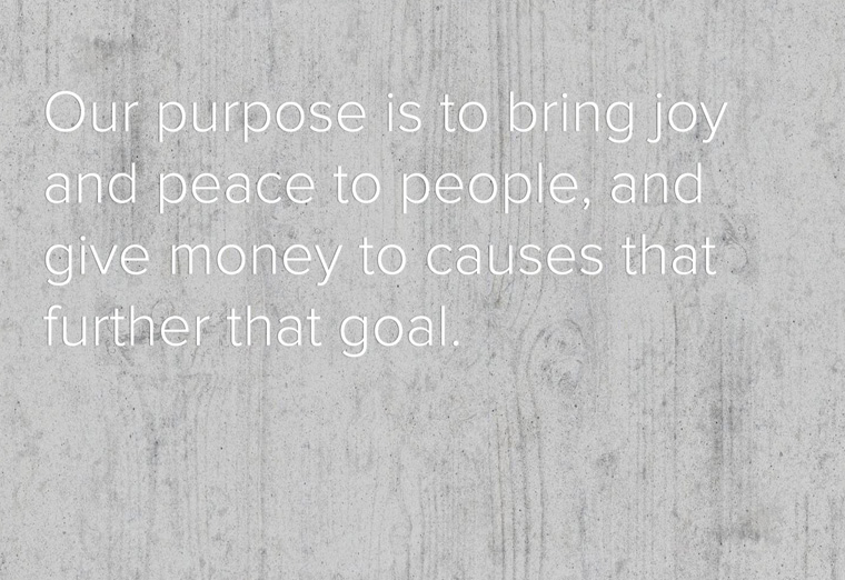
We also recognized that essential to growth would be preserving the distinctive brand idea—shaped by Lee’s remarkable story and personal vision for doing things differently. The real challenge was not to help the company “grow up”. It was to keep them special.
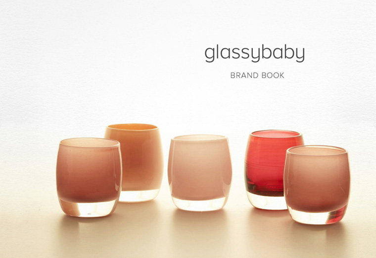
Our very first step was a brand strategy process, to clearly define the brand in terms of beliefs, product, practices and personality. This was captured in their Brand Book, to serve as a tool for all brand-related decisions. In doing so, we decentralized Lee’s vision so that everyone in the growing company can carry it forward consistently.
This resource also included visual identity standards, for proper use.

This clearly-defined vision guided all of our brand development recommendations, from visual identity, business collateral, messaging to retail design concepts.
The company has since added more stores in the Seattle area, as well as one in Manhattan. It turns out, being an odd company can win you lots of fans when you have a remarkable product and align the brand with the heart.